5. Advanced plotting
[status: mostly-written]
Motivation
A quick plot is OK when you are exploring a data set or a function. But when you present your results to others you need to prepare the plots much more carefully so that they give the information to someone who does not know all the background you do.
Prerequisites
The 10-hour “serious programming” course.
The “Data files and first plots” mini-course in Starting out - data files and first plots.
The “Intermediate plotting” mini-course in Section 3.
Plan
We will go through some topics in plotting that might come up when you need to prepare a polished plot for publication, or an animation for the accompanying materials in a publication.
This chapter will have a collection of examples that you might adapt to use in your papers or supporting web materials. They will all be based on the physical system of the harmonic oscillator, in this case a mass bouncing on a spring. (The harmonic oscillator equations are discussed and solved in more detail in the chapter Differential Equations.)
After showing simple oscillator line plots we will work through examples of adding touches that convey information about the axes and lines, as well as showing example captions for plots.
Then we will add another dimension: line plots that depend on a parameter can be viewed in interesting ways that give insight.
It’s hard to go beyond a surface plot, but there are some techniques to visualize more complex systems. Techniques that do this are volume rendering, isosurfaces and animations, and we will give examples of these.
5.1. Our setup
The same simple harmonic oscillator equations can describe very many physical systems. Ours will be a mass bouncing sideways on a spring as shown in Figure 5.1.1.

Figure 5.1.1 A mass bouncing on a spring. The zero position on the x axis is when the spring is at rest and does not push or pull the mass.
When we teach this in introductory physics classes we assume that there is no friction as the mass bounces to the right and left. We call that the simple harmonic oscillator (SHO). If there is friction it is a damped harmonic oscillator.
The spring has a spring constant \(k\) which represents how stiff it is. The force that returns the spring toward the rest position after you pluck it a distance \(x\) is \(F = -k \times x\). The mass is \(m\).
We are interested in the position of this mass as a function of time. The equation for this is:
This equation has two variables x and t, and two constants, A and \(\omega\).
\(A\) is the amplitude of the oscillation: the maximum displacement \(x\) will ever reach, both to the right and to the left. The angular frequency of the cosine wave is given by \(\omega = \sqrt{\frac{k}{m}}\). A few simple things we can say about this formula are:
The formula comes from solving Newton’s law: \(F = m a\) where the force is \(-k x\), so we have \(a + \frac{k}{m} x = 0\). Since the accelartion \(a\) is the second derivative of the position \(\frac{d^2x}{dt^2}\) or \(\ddot{x}\), so we have
\[\frac{d^2x}{dt^2} + \frac{k}{m} x = 0\]which is a differential equation which is solved by equation (5.1.1). I don’t discuss how to solve differential equations here (see the chapter on Differential Equations) since we are only interested in the plotting of solutions, so you can ignore that: we will focus on plotting the solution. I only mention the equation it comes from so you can start getting excited about the amazing world of mathematical physics that lies ahead of you.
Note
For teachers: this mention of of differential equations should be very rapid, or you could skip it altogether. Mentioning it gives a vision of depth, but you need to slip it in casually and without spending too much time on it, or it can be daunting for some students. You could say “you will see this toward the end of high school or in college; for now just look at it and let’s move on to the solution.”
If you pluck the spring to the right and then let it go, the amplitude \(A\) is how far you plucked it initially.
The initial velocity is zero: you just let it go, without a push in either direction.
The frequency \(f = \omega / (2 \pi)\) is greater with a stiffer spring, and smaller with a larger mass. The period is the inverse of the frequency: \(T = 1/f = 2 \pi / \omega\).
5.2. A first line plot
Let us now jump in to generating data for this system and plot it. A very simple program will generate the trajectory. Let us pick amplitude, spring constant and mass: \(A = 3, k = 2, m = 1\), and we have \(x(t) = 3 \cos(2 t)\). This program will generate the data:
#! /usr/bin/env python3

import math

A = 3.0
k = 2.0
m = 1.0
w = math.sqrt(k/m)

for i in range(140):
    t = i/10
    x = A * math.cos(w * t)
    print(t, '     ', x)
Run this program with
$ chmod +x generate-SHO.py
$ ./generate-SHO.py > SHO.dat
You can then plot it with something like:
gnuplot> plot 'SHO.dat' using 1:2 with linespoints
What you see is a plot of \(x(t)\) versus \(t\).
This plot gives you some insight: it shows you that if you pluck the spring to the right by 3 units it will bounce back and forth regularly, with an oscillation period of about 4 and a half units of time (more precisely \(T = 2 \pi / \sqrt{2} \approx 4.44\).
This plot is OK for you to get quick insight into the output of your
generate-SHO.py program.
But you would certainly not want to use it to present your results to someone else because of several problems:
There is no title in the plot.
The x (time) and y (x(t)) axes are not labeled.
The line has a very generic legend. It probably says something like
'SHO.dat' using 1:2, which is not informative.
In some situations this default plot might have other problems, like:
The
+signs for points might not be what you want (maybe a filled circle, or a hollow box are better).You might want a bit of padding on the y axis since the plot touches the top.
You might want to change the aspect ratio of the plot. The default is a rectangular overall shape, but sometimes you might want a different shape of rectangle, and sometimes you might want a square. Examples of a square aspect ratio are in Section 11.11.
There may be too many numbers on the x or y axes, so that they crowd in to each other.
5.3. Polishing line plots
Let us address the first two issues. We can choose labels for the x and y axes like this:
gnuplot> set xlabel 'time t (seconds)'
gnuplot> set ylabel 'spring displacement x(t) (cm)'
gnuplot> plot 'SHO.dat' using 1:2 with linespoints
With these instructions I have also communicated the units of measure I am using for these plots. Without units the plots are junk.
As for the legend for the line, we use the title directive in gnuplot’s plot command. Something like:
gnuplot> set xlabel 'time t (seconds)'
gnuplot> set ylabel 'spring displacement x(t) (cm)'
gnuplot> plot 'SHO.dat' using 1:2 with linespoints title 'simple harmonic oscillator'
We can also give the plot an overall title. This is not too interesting when we have a single line drawing, but if we have several lines then an overall title is useful.
gnuplot> set title 'Position versus time for harmonic oscillators'
gnuplot> set xlabel 'time t (seconds)'
gnuplot> set ylabel 'spring displacement x(t) (cm)'
gnuplot> plot 'SHO.dat' using 1:2 with linespoints title 'simple harmonic oscillator'
Gnuplot has very many options you can manipulate, and there is a vast collection of demos at http://gnuplot.sourceforge.net/demo/ – it is quite rewarding to go through all the demos and adapt them to the things you might need to plot.
5.4. Increasing the challenge: parametrized solutions
The simple harmonic oscillator is not a terribly rich system, so we will add a bit more to it by looking at the damped harmonic oscillator. The equation for this is:
where \(c\) is a constant which expresses how much the system is damped by friction.
The solution is:
where the frequency \(\omega\) is:
Let’s do a quick function plot to try to underestand what a negative exponential times a cosine function looks like. In gnuplot you can type these instructions:
set grid
set xlabel 't (seconds)'
set ylabel 'x (cm)'
plot [0:10] exp(-x/2), \
     exp(-x/2) * cos(4*x)
The result should look like:

Now that we have an idea of the shape of a damped cosine curve, let us look briefly at equations (5.4.1) and (5.4.2) and imagine in our minds how they might behave.
Overall the shape of the damped oscillator solution should look like
fig-damped-cosine
The exponential factor \(e^{-c/(2 m)}\) is what makes the oscillations get smaller, and if the friction \(c\) is big then it will damp much faster, while if the mass is big it will damp less (more inertia).
The cosine factor \(\cos(\omega t)\) means that you have oscillations (at least until it has damped a lot), and equation (5.4.2) tells us that the friction has made the frequency of the oscillations somewhat smaller than the natural frequency \(\sqrt{k/m}\) of the undamped oscillator.
All of this depends on the friction constant \(c\).
But how do we visualize this curve for different values of \(c\)? Let us start by writing a program which prints out several columns for \(x(t, c)\) with a few different values of \(c\).
#! /usr/bin/env python3

"""A simple program to print solutions to the damped harmonic oscillator in columns."""

import math

# parameters that descibe the damped harmonic oscillator for a mass on a spring
A = 3.0                         # amplitude
k = 2.5                         # spring constant (stiffness)
m = 1.0                         # mass

damping_constants = [0, 0.5, 1.0, 1.5, 2.0]
# first print some metadata with labels for the columns
print('## time', end="")
for c in damping_constants:
    print(f'        c_{c}', end="")
print()
# now loop through the times and print the time and the solutions x(t)
for i in range(300):
    t = i/10
    print(t, end="")
    for c in damping_constants:
        w = math.sqrt(k/m - c*c/(4*m*m))
        x = A * math.exp(- t * c*c/(2*m)) * math.cos(w * t)
        print(f'     {x}', end="")
    print()
You can run this with
chmod +x damped-oscillator-columns.py
./damped-oscillator-columns.py > damped-oscillator-columns.dat
and then plot it with:
# set terminal qt lw 4
set grid
set title 'Damped harmonic oscillator with various damping factors'
set xlabel 'time t (seconds)'
set ylabel 'spring displacement x(t) (cm)'
plot 'damped-oscillator-columns.dat' using 1:2 with lines title 'c=0.0' lw 2 , \
     'damped-oscillator-columns.dat' using 1:3 with lines title 'c=0.5' lw 2 , \
     'damped-oscillator-columns.dat' using 1:4 with lines title 'c=1.0' lw 2 , \
     'damped-oscillator-columns.dat' using 1:5 with lines title 'c=1.5' lw 2 , \
     'damped-oscillator-columns.dat' using 1:6 with lines title 'c=2.0' lw 2
The result should look like:

Figure 5.4.1 Damped harmonic oscillator with separate line plots for different values of the damping constant \(c\).
Figure 5.4.1 gives us some information if we pick through it. The legend tells us which colored line has \(c=0.0\), and that line should look like there is no damping, which is correct.
Then we see the line with \(c=0.5\) and we notice that (a) the peaks of the oscillation get smaller (the damping), (b) if you follow it further out you see that the peaks don’t line up with the peaks of the \(c=0\) curve (the frequency is a bit lower than the undamped curve, which validates equation (5.4.2)).
Then we see that the lines with more damping (c = 1.0, 1.5, 2.0) damp more quickly.
But we had to really pick through this plot and strain our eyes and patience to see those effects. Let us see if we can make the information about the \(c\) parameter come out more clearly.
5.5. Adding a dimension: surface plots
#! /usr/bin/env python3

import math

A = 3.0
k = 2.5
m = 1.0

print('## time  damping_c  x')

for ci in range(0, 60):          # loop on damping constants
    c = ci/40.0
    for ti in range(300):        # loop on time
        t = ti/10
        w = math.sqrt(k/m - c*c/(4*m*m))
        x = A * math.exp(- t * c*c/(2*m)) * math.cos(w * t)
        print(t, '   ', c, '    ', x)
    print()                     # blank line between damping constants
We can run this program with
chmod +x damped-oscillator-surface.py
./damped-oscillator-surface.py > damped-oscillator-surface.dat
# set terminal qt lw 4
set grid
set title 'Damped harmonic oscillator: displacement versus time and damping.'
set xlabel 't (seconds)'
set ylabel 'damping c'
set zlabel 'x(t) (cm)'
set pm3d
set hidden3d
set view 20, 60     ## set the viewpoint
splot 'damped-oscillator-surface.dat' using 1:2:3 with lines title ''
The surface plot looks like:

Figure 5.5.1 Surface plot of the damped oscillator for various values of the damping constant.
The main difference between Figure 5.5.1 and the figure with several lines: with the surface you can see the behavior of x versus t for very many values of c without having to scrunch your eyes. With a single glance you can see the effect of the damping constant: a downslope in the oscillatory behavior.
5.6. Adding a dimension: color
5.6.1. Spetrograms
If you want to represent the information about a voice, or music, or an animal call, or a radio signal.
Think carefully of what kind of information is in this type of signal. You will need to represent the intensity of the signal (for example how loud the music is or how strong a signal is) for each frequency, and all of this will depend on time.
One tool to visualize such signals is the spectrogram. Let’s start with picture:
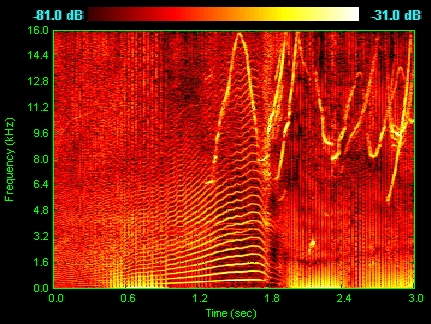
Figure 5.6.1 Spetrogram of a dolphin’s vocalizations. You can see chirps, clicks and harmonizing. (From Wikipedia)
In Figure 5.6.1 we see that the x axis is time, the y axis is frequency, and the loudness of the sound (in decibels) is represented by the color: black and dark red are more quiet, bright yellow and white are louder.
What you see visually is that the various features of the sound are seen in features of the spetrogram: the chirps are the inverted V shapes, the clicks are vertical lines, and the harmonizing is seen in the horizontal striations.
Once you get used to reading spectrograms you can quickly get a feeling for not just the volume of sound as a function of time, but also for in which frequencies those louder sounds occur.
Thus the use of color helps us get a quick-look view of the entire picture, and it helps us find distinguishing features in the data.
5.6.2. Spectrograms for standard acoustic files
Let us download a brief violin sample, specificially a single F note.
wget --continue http://freesound.org/data/previews/153/153595_2626346-lq.mp3 -O violin-F.mp3
This gives us the file violin-F.mp3. It’s hard to load this
file in as data, but we can do a couple of conversions with the
programs ffmpeg (which manipulates audio and video formats) and
sox, which manipulates some audio formats and can turn audio files
into human-readable columns of data.
ffmpeg -i violin-F.mp3 violin-F.aif
sox violin-F.aif violin-F.dat
We can look at violin-F.dat and see that it has three columns
of data. The first is time, the second is the left stereo channel,
and the third is the right stereo channel.
For simplicity we will analyze the left stereo channel. We use this

Figure 5.6.2 Spetrogram of a violin playing an F (Fa) note. Note the fundamental frequency at the bottom, and the many harmonics above that.

Figure 5.6.3 Spetrogram of the note of a tuning fork. This produces a 440 Hz A (La) sound. Note that there are almost no harmonics: the tuning fork is designed to put out a sound close to a pure sin wave.
Let us record our own signal so that we can experiment.
Type
rec myvoice.dat
then speak in to it for no more than two seconds and hit control-C to abort. You now have a file with time and one or two amplitude channels. You can look at it and plot it.
You can also record yourself playing a musical instrument, or clapping.
To play the sample back you can type:
play myvoice.dat
and you should hear back your brief audio sample.
But remember: we are scientists, not just users of gadgets, so when we think of an audio file we think of it as a data. You can look at the file with
less myvoice.dat
and you will see three columns of numbers. The first is time, the others are the amplitude of the sound in the left and right stereo channels.
music2spectrogram.py#! /usr/bin/env python3
import sys
import numpy as np
import matplotlib.pyplot as plt
import pylab
import lzma
# from xopen import xopen
def main():
if not len(sys.argv) in (2, 3):
print('error: please give an audio file argument')
sys.exit(1)
infile = sys.argv[1]
## find the sampling rate (in samples/sec) from the input file
Fs = get_sample_rate(infile)
outfile = None
if len(sys.argv) == 3:
outfile = sys.argv[2]
time = np.loadtxt(sys.argv[1], comments=';', usecols=(0,))
left_channel = np.loadtxt(sys.argv[1], comments=';', usecols=(1,))
## ignore the right channel (if there is one)
ax_plot = plt.subplot(211)
ax_plot.set_title('Amplitude and spectrogram for data file %s' % infile)
plt.plot(time, left_channel)
plt.ylabel('Amplitude')
ax_plot.set_xticks([])
ax_spec = plt.subplot(212)
plt.xlabel('Time')
plt.ylabel('Frequency')
Pxx, feqs, bins, im = plt.specgram(left_channel, Fs=Fs, cmap=pylab.cm.gist_heat)
# NOTE: here you could introduce frequency limits to zoom in on the Y axis
# but to make this feature selectable on the command line we would need
# to introduce argument parsing, so for now I just put a comment to show
# how this could be done to show frequencies from 20 to 2000
# plt.ylim(20, 2000)
cbar = plt.colorbar(orientation='horizontal') # show the color bar information
if outfile:
plt.savefig(outfile)
else:
plt.show()
def get_sample_rate(fname):
"""Read the first line in the file and extract the sample rate
from it. These ascii sound files are like that: two lines of
"metadata", of which the first has the sampling rate and the
second lists how many channels there are. This routine reads that
first line and returns the number. For compact disc music, for
example, it would be 44100 Hz.
"""
# with xopen(fname, 'rt') as f:
with my_compressed_open(fname, 'rt') as f:
line = f.readline() # get the first line
assert(line[:len('; Sample Rate')] == '; Sample Rate')
Fs = int(line[(1+len('; Sample Rate')):])
print('sample rate:', Fs)
return Fs
def my_compressed_open(fname, mode='r'):
"""See if it ends in .xz and if so opens with lzma; otherwise just open."""
if fname.endswith('.xz'):
return lzma.open(fname, mode + 't')
else:
return open(fname, mode)
main()
We can run this program with
chmod +x music2spectrogram.py
./music2spectrogam.py violin-F.dat
## or to save it to a file:
./music2spectrogram.py violin-F.dat violin-F_spectrogram.png
5.6.3. Ideas for further exploration
Earthquakes : color is magnitude
5.7. Loops in gnuplot
Look at examples from here:
http://gnuplot.sourceforge.net/demo/bivariat.html
in particular the fourier series.
5.8. Adding a dimension: animation
5.8.1. Animation in gnuplot
[FIXME: incomplete]
http://personalpages.to.infn.it/~mignone/Numerical_Algorithms/gnuplot.pdf
also:
5.8.2. Animation in matplotlib
simple-animated-plot.py
#! /usr/bin/env python3

## example taken from https://stackoverflow.com/a/42738014

import matplotlib.pyplot as plt
import numpy as np

plt.ion()
fig, ax = plt.subplots()
x, y = [],[]
sc = ax.scatter(x,y)
plt.xlim(0,10)
plt.ylim(0,10)

plt.draw()
for i in range(1000):
    x.append(np.random.rand(1)*10)
    y.append(np.random.rand(1)*10)
    sc.set_offsets(np.c_[x,y])
    fig.canvas.draw_idle()
    plt.pause(0.1)

plt.waitforbuttonpress()
simple_anim.py
#! /usr/bin/env python3
"""
==================
Animated line plot
==================

"""

import numpy as np
import matplotlib.pyplot as plt
import matplotlib.animation as animation

fig, ax = plt.subplots()

x = np.arange(0, 2*np.pi, 0.01)
line, = ax.plot(x, np.sin(x))


def init():  # only required for blitting to give a clean slate.
    line.set_ydata([np.nan] * len(x))
    return line,


def animate(i):
    line.set_ydata(np.sin(x + i / 100))  # update the data.
    return line,


ani = animation.FuncAnimation(
    fig, animate, init_func=init, interval=2, blit=True, save_count=50)

# To save the animation, use e.g.
#
# ani.save("movie.mp4")
#
# or
#
# from matplotlib.animation import FFMpegWriter
# writer = FFMpegWriter(fps=15, metadata=dict(artist='Me'), bitrate=1800)
# ani.save("movie.mp4", writer=writer)

plt.show()
using matplotlib’s FuncAnimation:
import matplotlib.animation as animation
import matplotlib.pyplot as plt
import numpy as np

fig = plt.figure()

def updatefig(i):
    fig.clear()
    p = plt.plot(np.random.random(100))
    plt.draw()

anim = animation.FuncAnimation(fig, updatefig, 100)
anim.save("/tmp/test.mp4", fps=24)
And from the matplotlib docs:
5.9. Further reading
See also
clean plots:
http://triclinic.org/2015/04/publication-quality-plots-with-gnuplot/
http://gnuplot.sourceforge.net/demo/
https://www.jstor.org/stable/pdf/2683253.pdf
more about sox and audio formats:
http://sox.sourceforge.net/sox.html
https://newt.phys.unsw.edu.au/jw/musical-sounds-musical-instruments.html
object oriented approach in matplotlib:
https://python4astronomers.github.io/plotting/advanced.html
more on matplotlib animation
https://nickcharlton.net/posts/drawing-animating-shapes-matplotlib.html
cool matplotlib resources: