8. Data Visualization
8.1. The Big Picture
The moment there is quantitative information involved in what you study, visualization comes in. Visualization is as much of an art as it is engineering, and practice in making graphs is a key workshop skill.
Most of us aren’t very used to looking at lists or charts of numbers and immediately noticing trends. When we put together a graph to display data, we translate numbers into something that an end user can understand with a single glance.
What we get from looking at graphs really are just inferences. Without further scrutiny and statistical testing, just seeing a general correlation on a graph isn’t enough to draw a really strong conclusion from, (Statistical tests can give you much stronger, quantitatively driven conclusions. You can read about them at this wikipedia page if you’re really interested) but it can provide a really strong foundation from which to develop an intuitive understanding of relationships between the data you’re looking at.
Data visualization is also an invaluable tool when it comes to communicating your findings. A graph can contain a lot of information in an easy to read and understand format. When you present an audience with a graph, they don’t have to just take your word for whatever relationships you’re trying to point out, they can look at the graph and come to conclusions themselves. By having your audience build their own intuitions about the data you’re presenting them with, their understanding will be vastly stronger.
Below we’ll walk through a few example data sets so that you can become familiar both with RAWGraphs and some various data-visualization methods.
8.2. The Data can Lead you Astray
Even though data visualizations represent data, the way the do so is being curated by the person who makes the visualization. When we make decisions about how we represent data, we can make changes to make the relationships we’re noticing clearer, but this can lead to somewhat misleading charts. Take the bar chart pictured below.
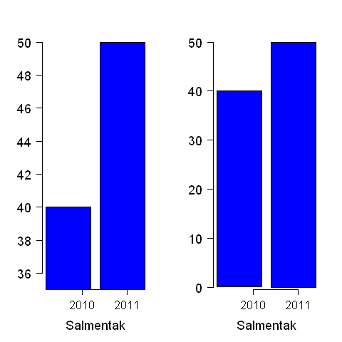
Figure 8.2.1 Image from wikipedia. https://en.wikipedia.org/wiki/File:Misusestatistics_0001.png
In the version of the bar chart on the left, the scale has been truncated. Notice how the scale on the left starts at 36, while the scale on the right starts at 0. When the scale is truncated, it makes the difference between the values seem much larger than in the full-scale graph on the right.
This isn’t necessarily a bad thing; sometimes those little differences are really important. However, when we read graphs, we should pay attention to how the graph has been constructed. What are the scales of the axes? How do they affect how you view the data? How is the data labelled? Is one of the labels inflamatory, or designed to provoke emotional reaction? Questions like these are how we critically examine visual data, and we need to keep them handy. Because visual data is so intuitive and easy to absorb, it can be easy to absorb uncritically and have something misleading slip past you.
8.3. Data Visualization Software
There are very many plotting systems, from those that allow quick plots of a data file from the command line (gnuplot), to those that tie in to a language and allow remarkable microscopic adjustments in the plots (matplotlib), to those that offer a rich feature set even though deployed through the web (RAWGraphs [Mauri et al., 2017]).
For the research skills academy we will work with the RAWGraphs system, since we do not assume that everyone is running an advanced programming/scientific platform. RAWGraphs can be accessed through a web browser at: https://app.rawgraphs.io/ and the underlying software is free/open-source which any user can deploy on their own web site as well.
Getting comfortable with RAWGraphs is a pleasant task with no great conceptual difficulty. RAWGraphs has its own set of tutorials at https://rawgraphs.io/ and they are quite effective. What I show here are some examples of tutorials we will work through together in the research skills academy.
8.4. The !Kung of the Kalahari Desert (Bubble Chart)
Nancy Howell collected data from the !Kung people, sometimes known as the “Bushmen”, a population of hunter-gatherers that live in the western portion of the Kalahari desert, between Namibia, Angola, and Botswana. A summary of Howell’s work is in Steven Johnson’s twitter sequence.
One of Howell’s data sets can be found in the 538 data collection by
searching for Howell1.csv which should lead to this link:
https://raw.githubusercontent.com/rmcelreath/rethinking/master/data/Howell1.csv
and we will look at it using the bubble chart feature in RAWGraphs. Their bubble chart is a more featured version of the traditional “scatter plot”.
You should download from this link into a file called Howell1.csv
at which time you will be ready to upload it into RAWGraphs so that we
can analyze it.
You can also go to the “raw” data in github, and then select, copy, and paste into the RAWGraphs input text area.
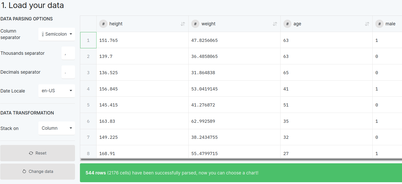
Figure 8.4.1 Loading your own Howell1.csv file into RAWGraphs and selecting Semicolon as the column separator.
The most annoying thing to notice about this dataset is that numbers are separated by semicolons instead of commas (commas are more common for simple spreadsheet files). So you have to find the “column separator” widget and select semicolon.
Then, following the figure below, you can select the “age” dimension for the “X axis”, and the “height” dimension for the “Y axis”.
You can go further and choose to color the points in the plot based on the column called “male”, which in this dataset has 1 for males and 0 for females. The lower part of the next figure shows the color-coded difference.
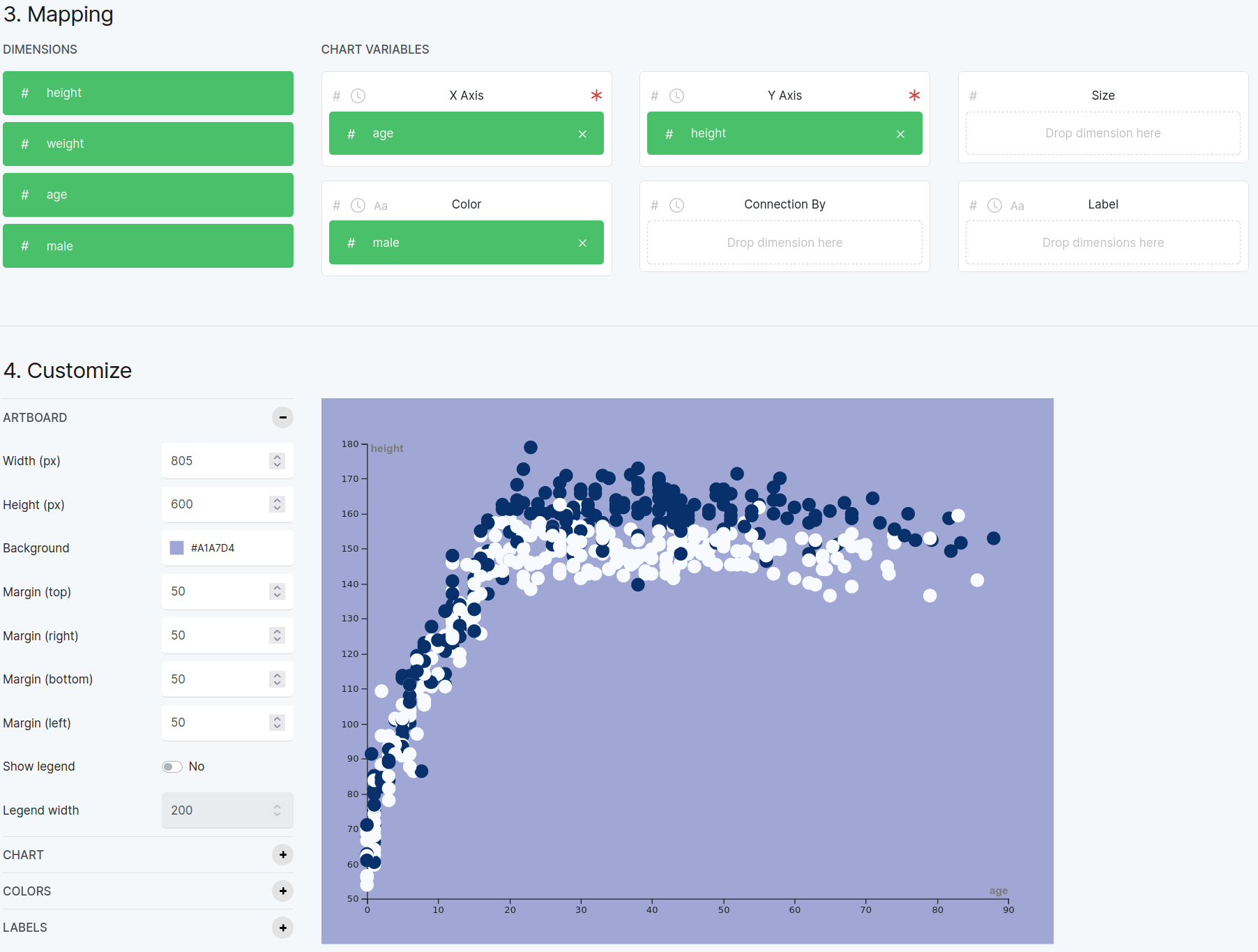
Figure 8.4.2 A result based on the Howell1.csv data set. This shows height versus age, allowing you to distinguish between male and female portions of the dataset.
Another way you could look at the data is height versus weight. The next plot shows how to map height to the X axis, and weight to the Y axis.
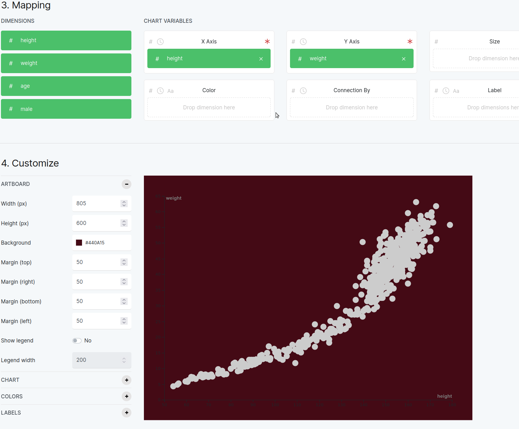
Figure 8.4.3 This plot shows weight versus height.
You can add further differentiating bits to the bubble chart: color and size of bubbles. Our last example for the Howell1.csv dataset shows how to color-code by sex and make the bubble sizes depend on the age column.

Figure 8.4.4 This plot shows weight versus height, but also colors the bubbles for sex and makes their size depend on the subject’s age..
What further insight can we gain here?
8.5. A Fingerprint of a Soccer Player’s Effectiveness (Radar Chart)
Pick the FIFA Player Statistics dataset from the Try our data samples option in RAWGRaphs.
Then pick the chart type Radar Chart.
Then pick a mapping of fields as shown in the figure below:
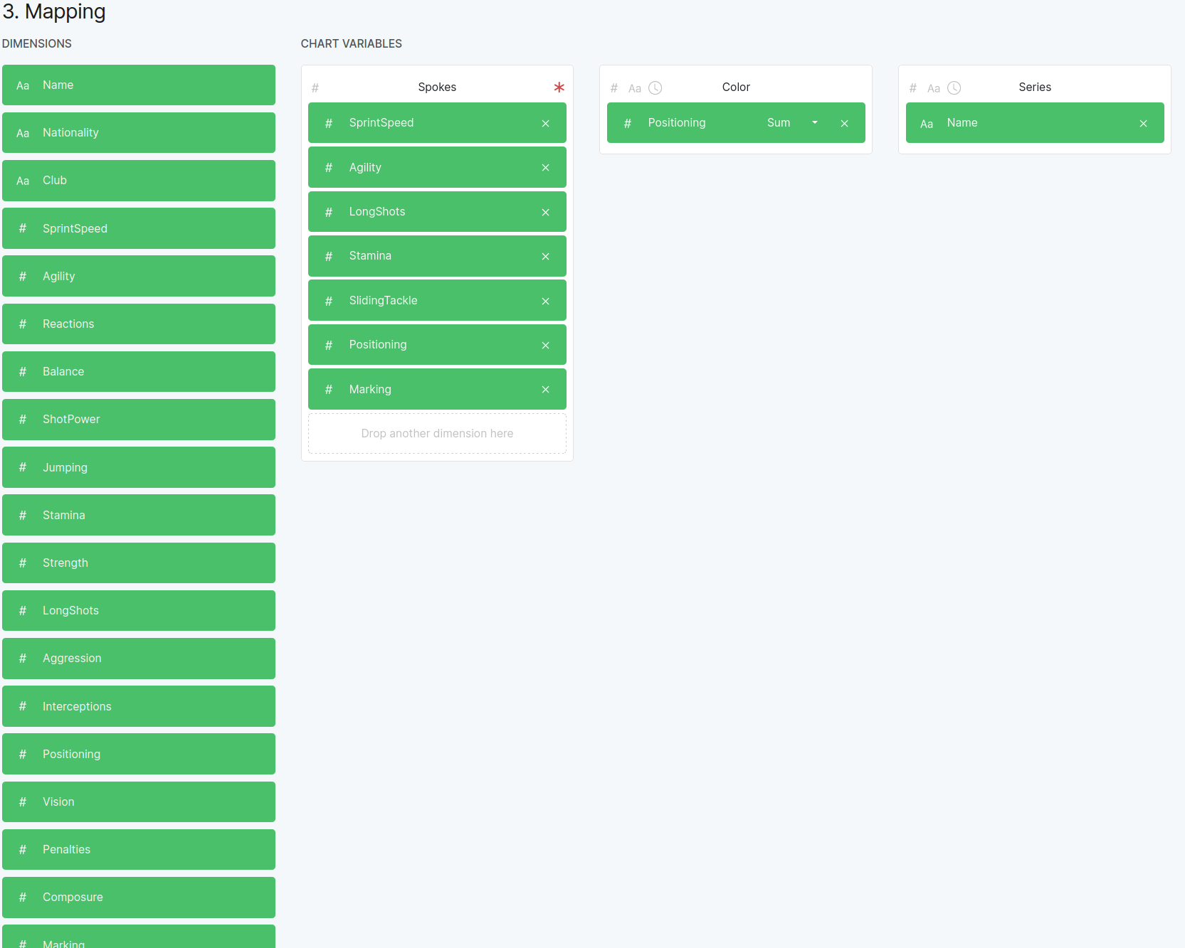
Figure 8.5.1 Mapping various fields in the FIFA data into parts of the plot.
Which should give you the result shown here:
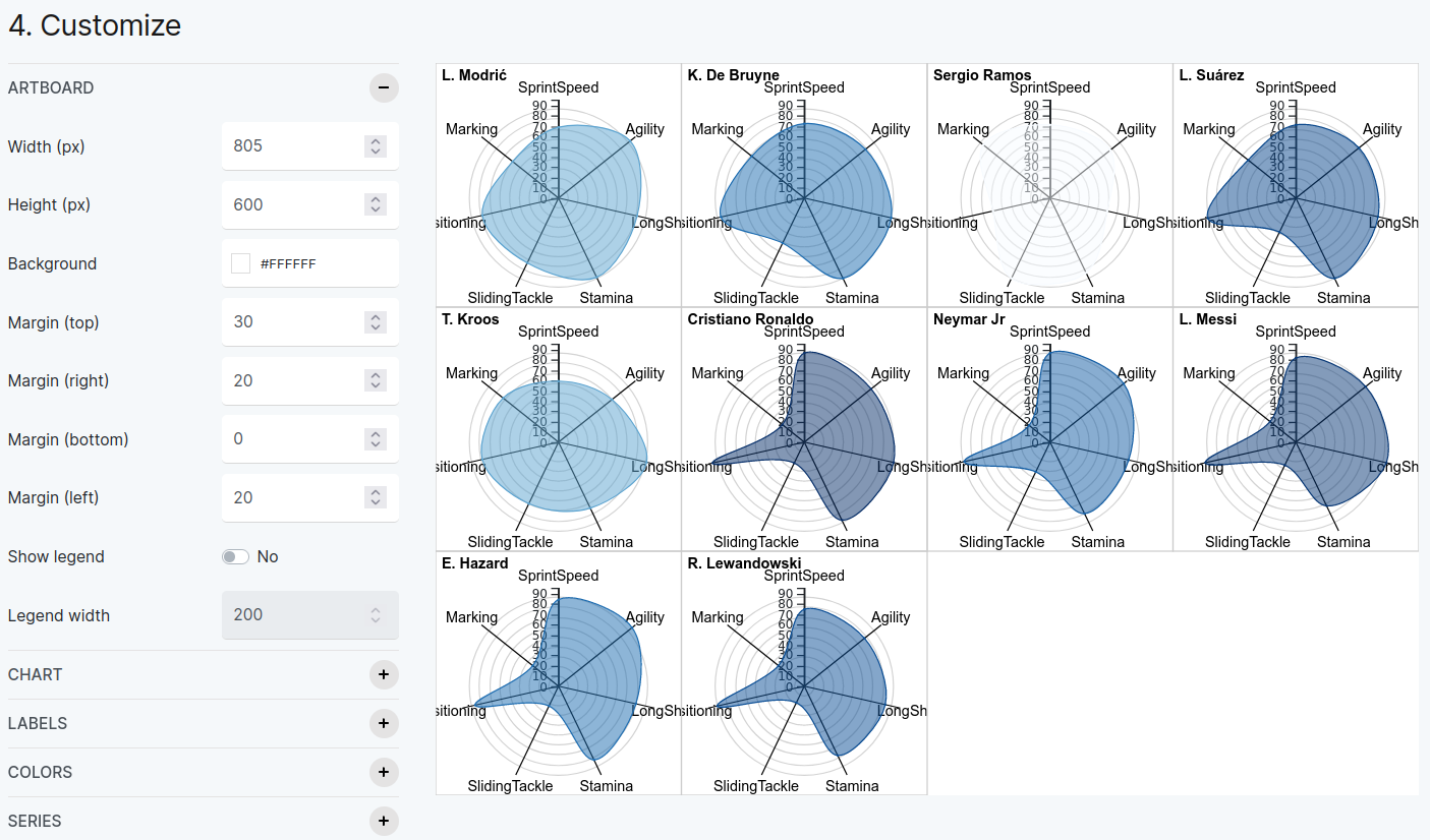
Figure 8.5.2 The results of the FIFA radar chart.
Now discuss what insights you can get from this. Soccer fans will be able to help the rest of the group discuss which are famous for attacking versus defending skills.
What should emerge from the discussion is this idea of a “fingerprint” or “signature” of a player, which makes the player different.
8.6. Foreigners Living in Milan (Bumpchart)
Pick the “Try our data samples” option in RAWGraphs, then pick the “Foreign residents in Milan” data set.
Make sure you set the “date” column to be a date in DD/MM/YYYY format, so it is interpreted as a date instead of a string.
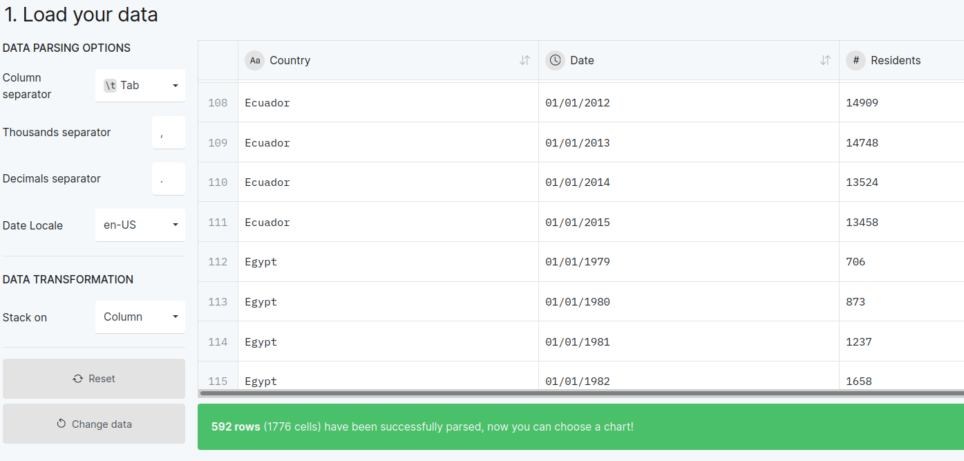
Figure 8.6.1 Note that we have set the “date” column to be a date in DD/MM/YYYY format.
Now select the Date column for the X axis, the “# residents” column for the Size chart variable, and the Country column for the Streams chart variable. You can see that selection in the next figure, and the plot should look like what you see below.
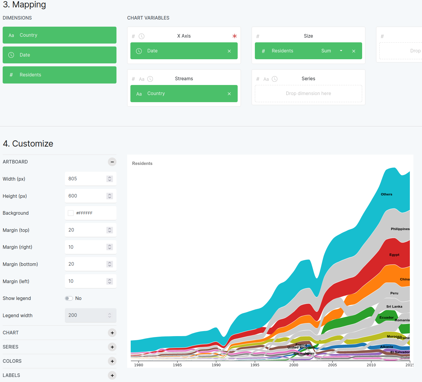
Figure 8.6.2 Customize the plot like this to get the bump chart here.
8.7. A Treemap of Orchestra Hierarchies
Follow the RAWGraphs tutorial on treemaps to get pictures like this one:
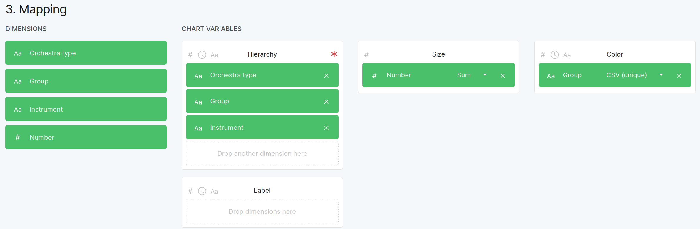
Figure 8.7.1 The mapping of columns to treemap features for the Orchestra structure example.

Figure 8.7.2 The result of the RAWGraphs tutorial on making a treemap.